May 18, 2020
The free CV19 Lab Testing Dashboard powered by hc1 is a prime example of hc1’s collaboration core value put into practice. I spoke with Val Spangler, hc1’s senior business intelligence consultant, about the team effort required to go from data feeds to a delivered dashboard in 3 weeks.
As COVID-19 spread across the United States in late February and early March, the hc1 team was thinking about ways we could help public health officials and healthcare organizations address this crisis. Our data engineers dived into the hc1 data lake to track the increasing volume of SARS-CoV-2 PCR (polymerase chain reaction) test results. With this de-identified test results data as the starting point, the project took off.
Service delivery managers and data analysts worked with our customers to gather panel names and other testing information to ensure that we were looking at the right results data and interpreting it correctly. Meanwhile, the business intelligence team tackled the task of how to present the data in a way that would be most valuable for our users. Val was tapped to build a prototype on March 13, the last day hc1 offices were open before we all started working from home. “That day, I had maybe a map and two summary metrics on a dashboard,” she said.
Soon after, all 5 members of the team were combining their different strengths to build the model, complete a technical design, and ensure good user experience. As the CV19 Lab Testing Dashboard evolved to include national, state, and county dashboards of COVID-19 test results data, the team grappled with how to meaningfully compare urban, suburban, and rural counties with widely varying population totals. Contributing partner Looker was available to provide the needed geoanalytics expertise. “They introduced PUMA to us, which was fantastic,” Val said. A PUMA (Public Use Microdata Area) is a U.S. Census grouping of at least 100,000 people within a state for demographic purposes.
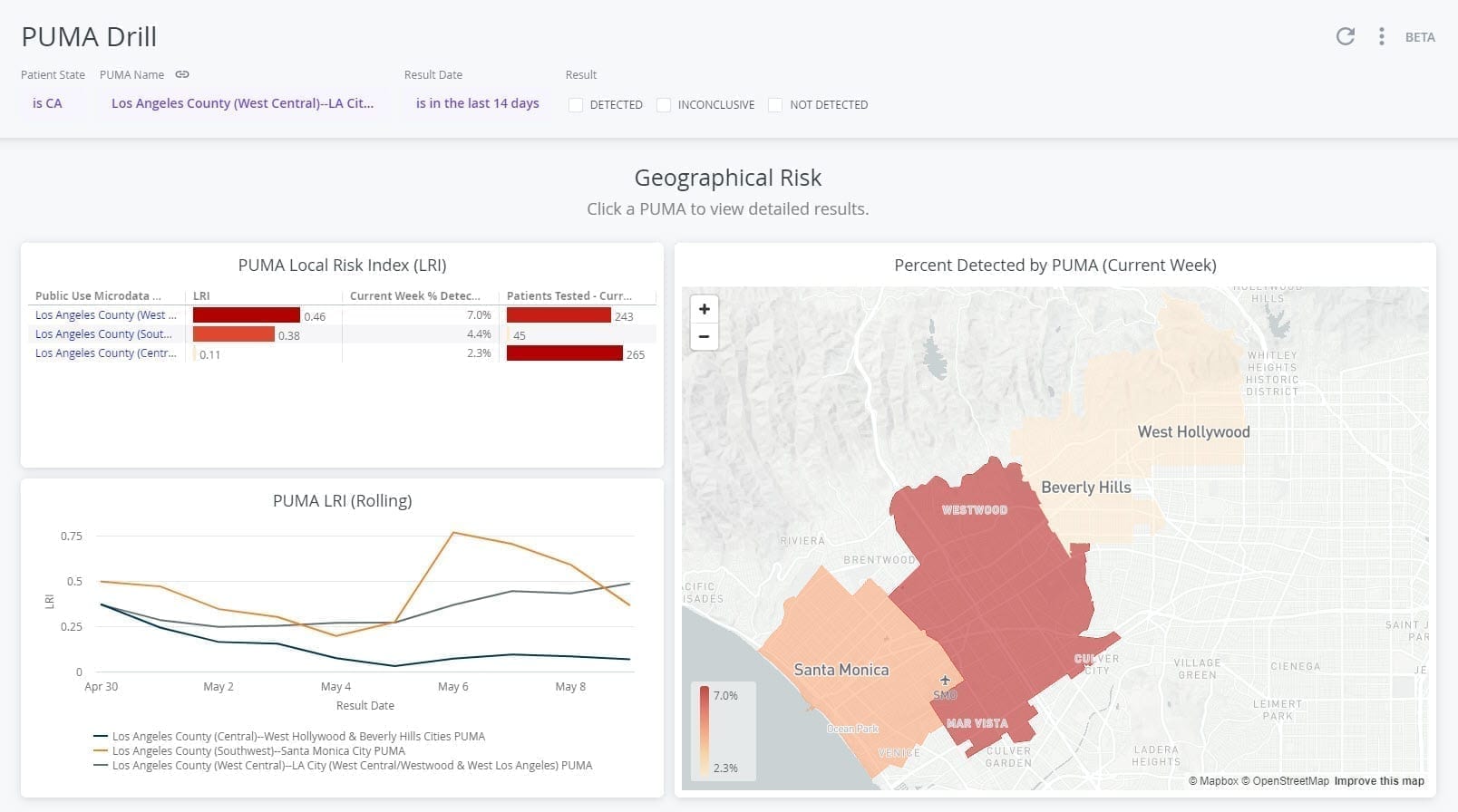
Figure 1: CV19 Lab Testing Dashboard comparing 3 PUMAs within Los Angeles County, California.
To pull in and point to the needed reference data in our Snowflake data warehouse and figure out how to embed the dashboard on a site so users could access it, the business intelligence team turned to our software architects and learned some new skills in the process. They are now empowered to write their own Snowflake queries as they work on improvements for the next dashboard release.
As sales team members called their lab contacts to spread the word about signing up to access the dashboard and encourage them to join the CV19 Lab Testing coalition, the marketing team designed the cv19dashboard.org site with contributing partner Design on Tap and worked on a launch campaign. Support and the product team developed a user registration and approval process.
Since the launch of the CV19 Lab Testing Dashboard on April 3, we’ve added Local Risk Index information and made a county-level version available to the general public as part of the American Enterprise Institute’s COVID-19 Tracker site. We’re using what we’ve learned to integrate antibody test results data in an upcoming release.
Having so many teams involved in the initial project created challenges—name changes, fluctuating requirements, rebuilds, increased pressure for quick delivery—but facing those challenges made the dashboard better. The strong collaboration between teams within hc1 and with our trusted partners enabled us to achieve the goal of providing a useful resource for healthcare professionals to combat COVID-19. “I was shocked and amazed at how quickly we were able to get this going,” Val said. “Hurdles that everyone was able to knock down so quickly, man, that was amazing.”


4 Ways to Improve the Sendout Testing Process


Feeling Overwhelmed as a Lab Manager?


Infographic: The State of Laboratory Staffing